
Choosing Colours for Your Interiors Based on Light and Room Direction.
When decorating a home, one of the most overlooked factors in choosing paint colours is the natural light that fills each room. The direction your space faces dramatically changes how colours appear throughout the day – affecting warmth, mood, and the atmosphere of your interior. Here’s how to select the perfect tone for every orientation.
South-Facing Rooms: Warm and Sunlit All Day
South-facing rooms are bathed in golden light for most of the day, bringing out the warmth in any colour. These rooms are the easiest to decorate because almost any palette looks vibrant and true to tone.
Cooler hues, like gentle blues or greens, balance the warmth if you prefer a calmer effect. Warm neutrals and soft whites enhance the natural brightness.
These rooms amplify warmth, so opt for Farrow & Ball’s Wevet (soft white with grey undertones) on walls, paired with Mizzle (muted green) accents and Sulking Room Pink for a sultry feature wall. Little Greene’s Portland Stone family adds versatile beige-grey depth, while Mylands’ warm neutrals like their taupe shades keep it balanced and bright.
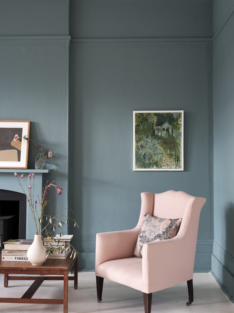
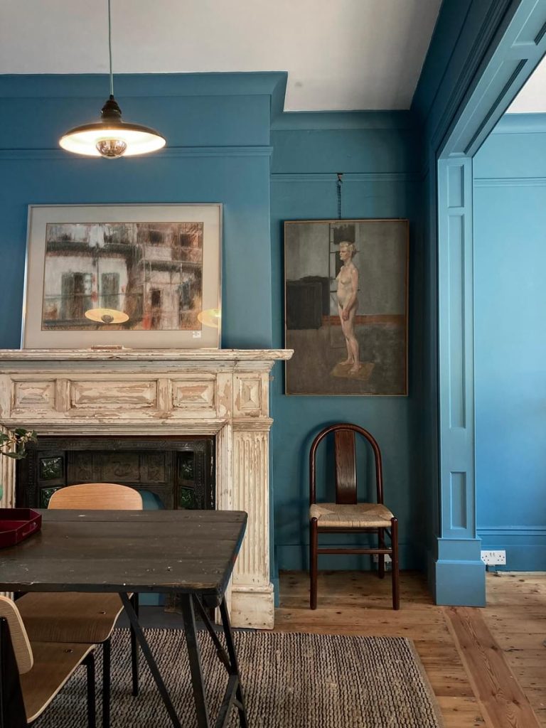
North-Facing Rooms: Embrace the Cool Light
North-facing rooms receive the least direct sunlight, often making colours appear muted or slightly greyer. Instead of fighting the cooler light, lean into it.
Avoid overly cool colours, as they can make the room feel flat or cold. Choose warm, rich shades such as earthy terracottas, mustard yellows, or deep greens to create a cosy feel.
Embrace deeper tones: Farrow & Ball’s French Gray (grey-green) warms the space, with Oxford Stone as a taupe neutral for walls. Little Greene shines with Stock (creamy white), French Grey family, or Yellow-Pink (mustard) alongside Marine Blue for richness. Mylands’ Threadneedle (soft pink with orange hints) or deeper greens like Little Greene’s equivalents create inviting cosiness.
East-Facing Rooms: Bright Mornings, Muted Afternoons
East-facing spaces enjoy bright, fresh light in the morning before it softens into cooler tones later in the day.
If the room is used more in the afternoon, choose colours that still feel inviting when the light fades – warm greys or mid-tone greens work particularly well.
Morning sun calls for Farrow & Ball’s Borrowed Light (pale blue) or Pavilion Blue to glow early, transitioning smoothly to afternoon calm with Little Greene’s Celestial Blue. Mylands’ 2026 Colour of the Year responds well to this shift, paired with warm greys for balance throughout the day.
West-Facing Rooms: Subtle Morning, Glowing Evenings
West-facing rooms have a gentle, subdued light in the morning, turning into rich, golden light in the afternoon and evening. To balance brightness, pair with muted accents or natural textures.
Cooler mornings suit Farrow & Ball’s Blackened (cool white) evolving into afternoon glow with warm ochres like their French Gray variants. Little Greene’s Castell Pink or Garden green leverages the golden light, while Mylands’ earthy pinks add sunset vibrancy without overwhelming
Bringing It All Together
Light changes throughout the day, so always test paint samples before deciding. Observe how they shift from morning to evening – a colour that looks perfect in sunlight might feel completely different under artificial light at night.
Choosing a colour palette that works harmoniously with your room’s natural light can transform how the space feels and functions, making every room feel just right, no matter the time of day.
We’re always here to help with paint choices and colour schemes. Feel free to pop into the shop and pick up a sample pot before committing to a full‑size tin. It’s the best way to make sure you love the shade in your space.