
The New Era of Pink: How Premium Paint Brands Are Redefining a Timeless Colour
Pink has stepped confidently into the spotlight – no longer reserved for nurseries or nostalgic accents, but celebrated as one of the most versatile, mood‑enhancing colours in contemporary interiors. Today’s premium paint houses have elevated pink into a sophisticated palette that can be soft, bold, grounding, or joyfully uplifting.
For designers and homeowners seeking fresh ways to energise their spaces, the new wave of pinks offers a gentle step toward brighter days. These hues bring warmth, optimism, and a whisper of spring, all while remaining effortlessly modern and timeless.
Below is a curated look at standout pinks from Mylands, Farrow & Ball, and Little Greene – and how each shade can transform an interior with intention and style.
Mylands: Understated Elegance with a Modern Edge
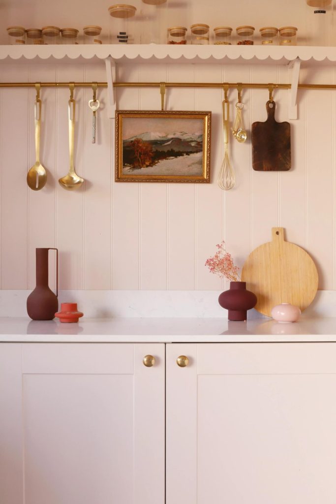
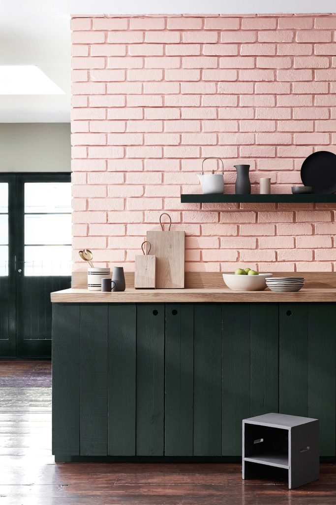
Threadneedle™ No.262 – Kitchen Cabinets
A refined, urban pink with a grounded undertone, Threadneedle No.262 brings a contemporary softness to cabinetry.
- Works beautifully with natural stone, brushed brass, and warm woods.
- Ideal for kitchens where you want subtle colour without overwhelming the space.
- Adds a sense of calm sophistication – perfect for clients seeking a modern yet comforting palette.
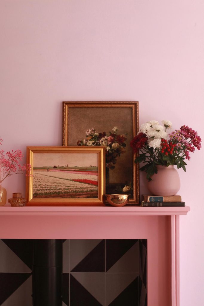
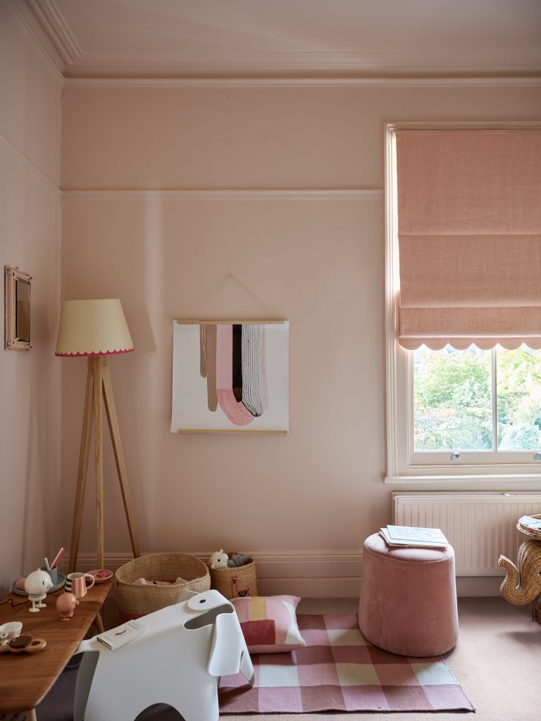
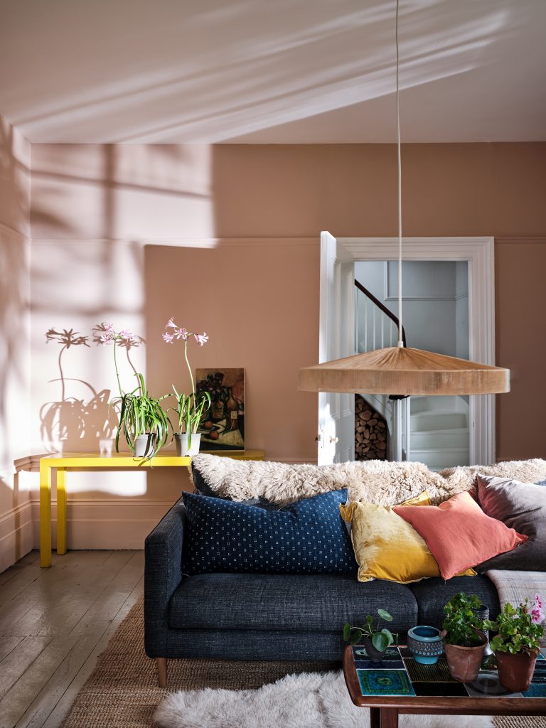
Floris™ No.27 & Pink House Pink – Walls & Fireplace
Floris No.27 is a delicate, powdery pink that feels airy and uplifting, while Pink House Pink adds a more traditional, rosy warmth.
- Together, they create a layered, harmonious scheme.
- Floris brightens open-plan spaces; Pink House Pink draws attention to architectural features like fireplaces.
- A great pairing for period homes or contemporary spaces needing softness and charm.
Farrow & Ball: Iconic Pinks with Character
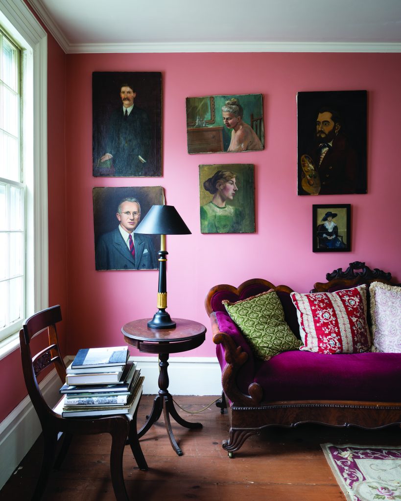
Nancy’s Blushes No.278 – Walls
One of Farrow & Ball’s most joyful pinks, Nancy’s Blushes is fresh, optimistic, and full of personality.
- Perfect for accent walls, children’s rooms, or creative studios.
- Its clean undertone keeps it from feeling sugary, making it a favourite among designers seeking a modern pink with clarity.
Setting Plaster No.231, Wimborne White No.239 & Babouche No.223 – A Warm, Sunlit Trio
Setting Plaster is a designer favourite for good reason—its plaster‑like warmth creates a lived‑in, effortless elegance.
- Pairing it with Wimborne White softens the palette and enhances natural light.
- Adding Babouche introduces a sunny, golden accent that energises the scheme.
- This trio is ideal for living rooms, hallways, and spaces where warmth and subtle sophistication are key.
Little Greene: Playful, Layered, and Full of Depth
Confetti 274, Lamp Black 228 & Salix 99
Confetti 274 is a cheerful, contemporary pink that pairs beautifully with the drama of Lamp Black and the gentle green of Salix 99.
- This combination creates a dynamic, design‑forward palette.
- Perfect for boutique-style interiors, feature walls, or creative commercial spaces.
Hellebore 275, Olive Colour 72, Carmine 189, Citrine 71, Lemon Tree 69, Pink Slip 220 & Loft White 222
This curated selection from Little Greene showcases the brand’s mastery of colour harmony.
- Hellebore and Pink Slip offer soft, romantic pinks.
- Carmine and Citrine introduce bold contrast and energy.
- Olive Colour and Lemon Tree add earthy and citrus notes for a balanced, nature-inspired scheme.
- Loft White ties everything together with a clean, modern finish.
This palette is ideal for designers who love to experiment with layered colour stories and want to create interiors that feel both curated and expressive.
Why Pink Works So Well in Modern Interiors
Pink’s resurgence is no accident. Its versatility makes it one of the most emotionally intelligent colours in design today.
Mood-Enhancing
Soft pinks create calm, restorative environments. Brighter pinks add joy and vibrancy. Earthy pinks bring warmth and grounding.
Universally Flattering
Pink complements natural materials – oak, walnut, marble, linen – and pairs beautifully with both warm and cool neutrals.
Timeless Yet Trend-Forward
From blush to coral to dusty rose, pink adapts effortlessly to evolving design trends while maintaining a classic appeal.
Works Across Styles
- Scandinavian minimalism
- Modern rustic
- Mid-century
- Contemporary luxury
- Eclectic, artistic interiors
Pink can be tailored to any aesthetic with the right tone and pairing.
Pink is no longer a bold commitment – t’s a gentle invitation to embrace warmth, creativity, and optimism. Whether you’re designing a serene bedroom, a lively kitchen, or a statement commercial space, premium paint brands offer a spectrum of pinks that elevate interiors with depth and personality.
For designers and homeowners who want to stay ahead of the curve, exploring these nuanced pinks is a beautiful way to bring fresh energy into any space.