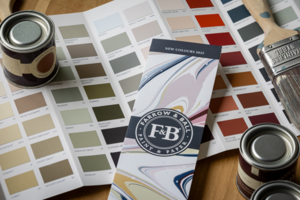
The Extraordinary Ordinary: Farrow & Ball’s New Colours Celebrate Everyday Beauty.
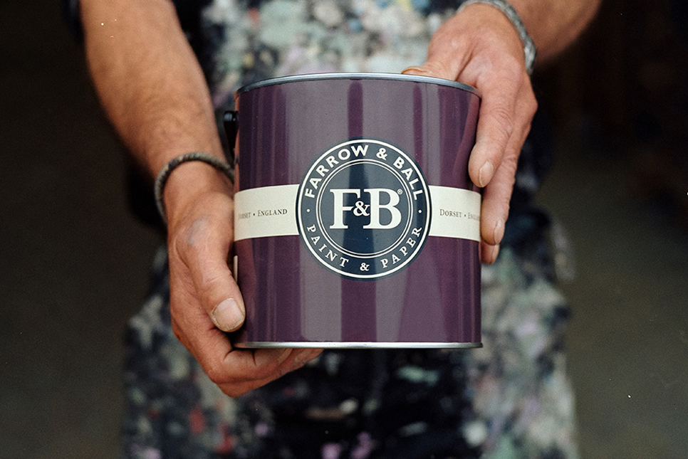
At Ashley & Lewis, we know that colour is more than a finishing touch, it’s the soul of a space. It sets the tone, tells a story, and transforms the everyday into something extraordinary. That’s why we’re thrilled to introduce the latest collection from Farrow & Ball: nine new colours and three returning favourites, all handcrafted in Dorset, England.
Farrow & Ball has been perfecting the art of paint since 1946, and this new palette is a testament to their timeless craftsmanship and creative spirit. Inspired by the “extraordinary ordinary,” these shades celebrate the quiet beauty of daily life – the textures, tones, and moments that often go unnoticed but make a house a home.
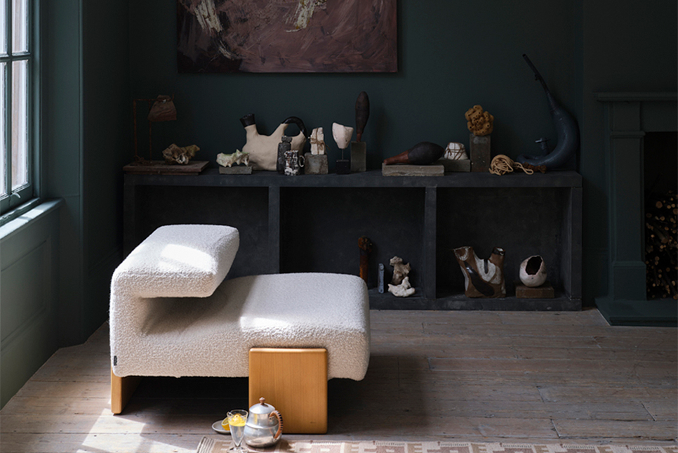
Whether you’re a homeowner planning a refresh, a trade professional seeking reliable inspiration, or an interior designer chasing the next big trend, this collection offers something for every vision.
Let’s explore the palette
Etruscan Red – A deep, brown-based red inspired by ancient civilisation. Less intense than Preference Red, it brings warmth and richness to any room.
Broccoli Brown – A hushed, dark stone that pairs effortlessly with natural materials like wood and stone. Reserved yet comforting, it’s ideal for grounding spaces.
Sap Green – An earthy olive green that celebrates nature. In small spaces, it becomes wonderfully intense-perfect for feature walls or cosy corners.
Scallop – A softer salmon shade, inspired by the gentle hue and curved shape of shellfish. A lighter take on Dead Salmon, it adds softness and charm.
Dibber – A down-to-earth green named after the gardening tool used to plant seeds. It’s a nod to nature and a beautiful choice for kitchens or garden rooms.
Reduced Green – A dark, earthy neutral where green pigment is barely there. Sometimes green, sometimes brown—it’s subtle, sophisticated, and endlessly versatile.
Sizing – A clean, crisp neutral with blue undertones. Like the starch it’s named after, it brings freshness and clarity to any palette.
Naperon – A worn terracotta with a well-loved feel. Inspired by the origins of the word “apron,” it’s warm, familiar, and full of character.
Marmelo – A comforting orange named after the marmelo quince, the fruit behind marmalade. It’s deliciously cosy and perfect for creating inviting spaces.
Kakelugn – A cleaner light blue, inspired by Swedish folkloric fires. A fresh take on the beloved Light Blue, it’s airy, calm, and highly requested.
Douter – A smoky grey-green that sits between Inchyra Blue and Green Smoke. It evokes the tarnished brass of traditional candle snuffers—moody and elegant.
Duster – A familiar ochre that celebrates the humble cleaning cloth. Aged and nostalgic, it adds warmth and a touch of whimsy.
This collection invites you to embrace the beauty of the everyday. It’s about finding joy in the familiar, elevating the ordinary, and creating spaces that reflect your story.
Visit us in-store or online to explore the full range, get expert advice, and find the perfect shade for your next project.